CASE:
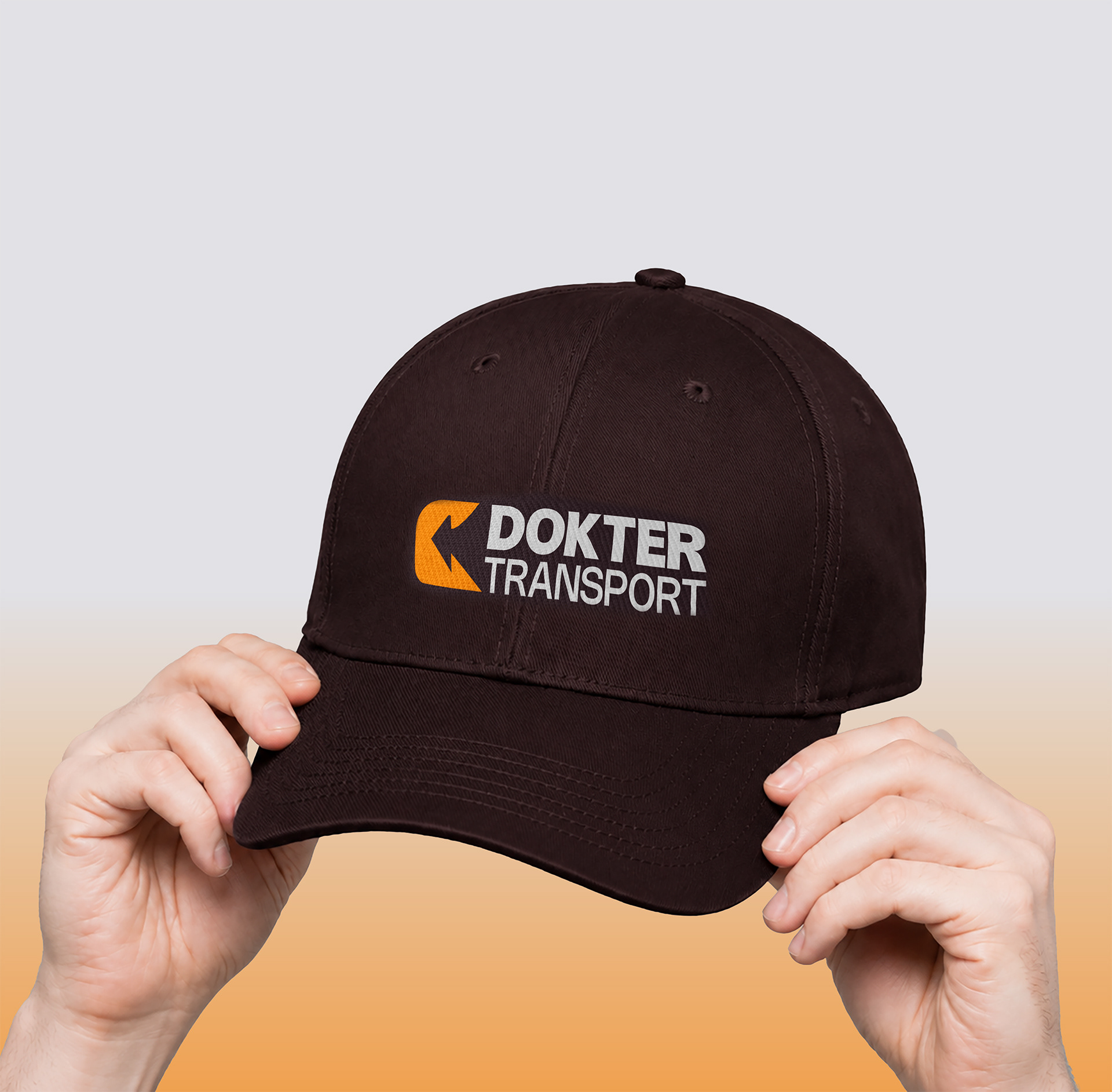
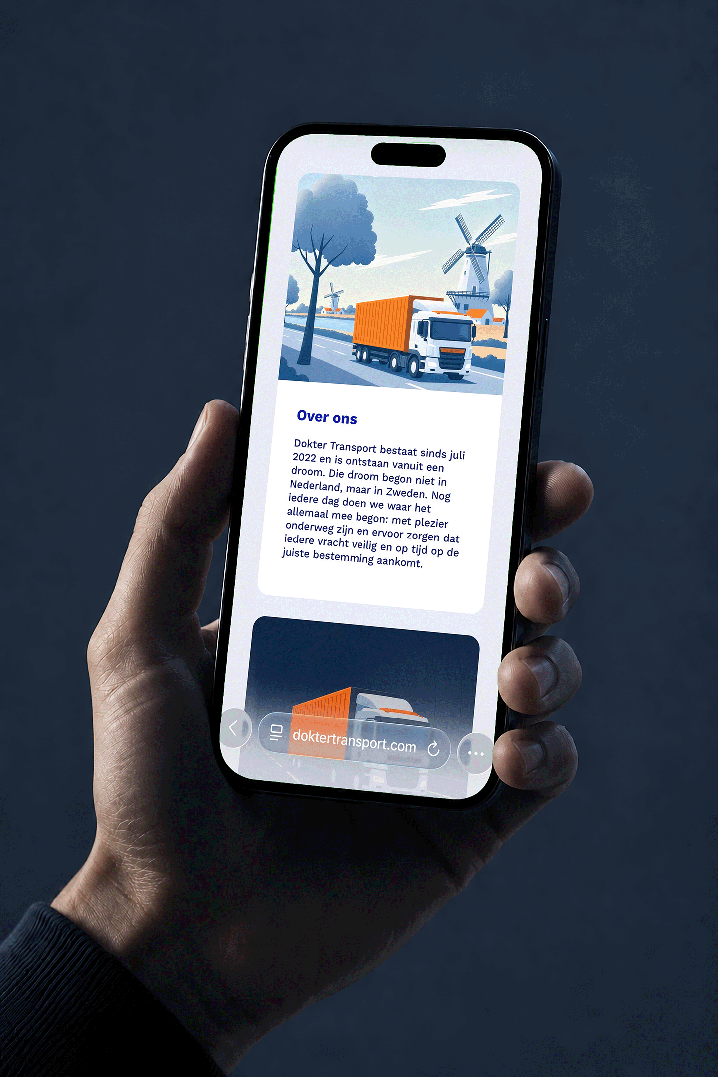
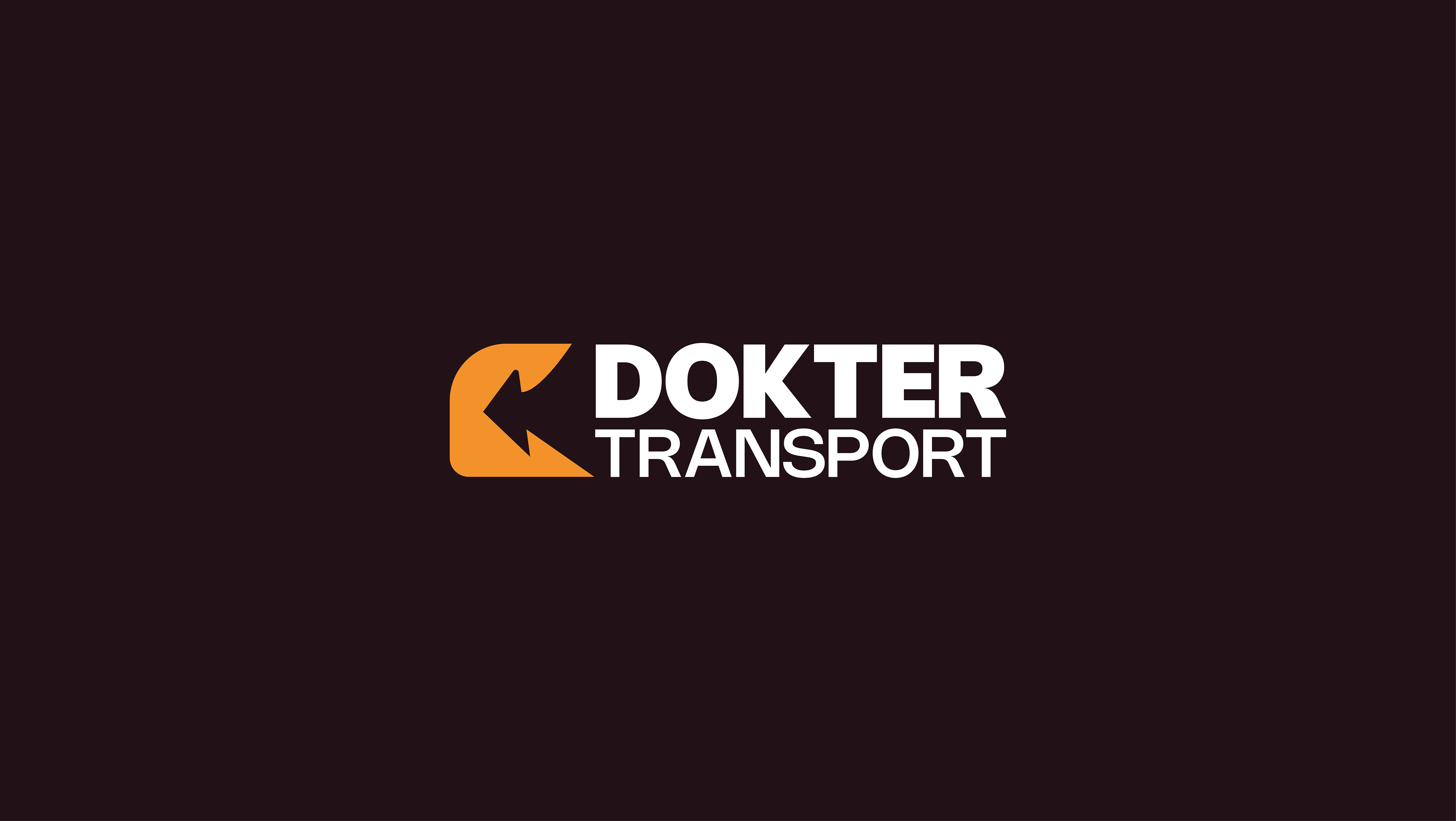
Dokter Transport was born from a family dream and a passion for the road. They approached me to develop a complete brand identity that is inspired by the cultural landscapes of Western and Northern Europe, while keeping its heart firmly connected to the Dutch village where the business operates.
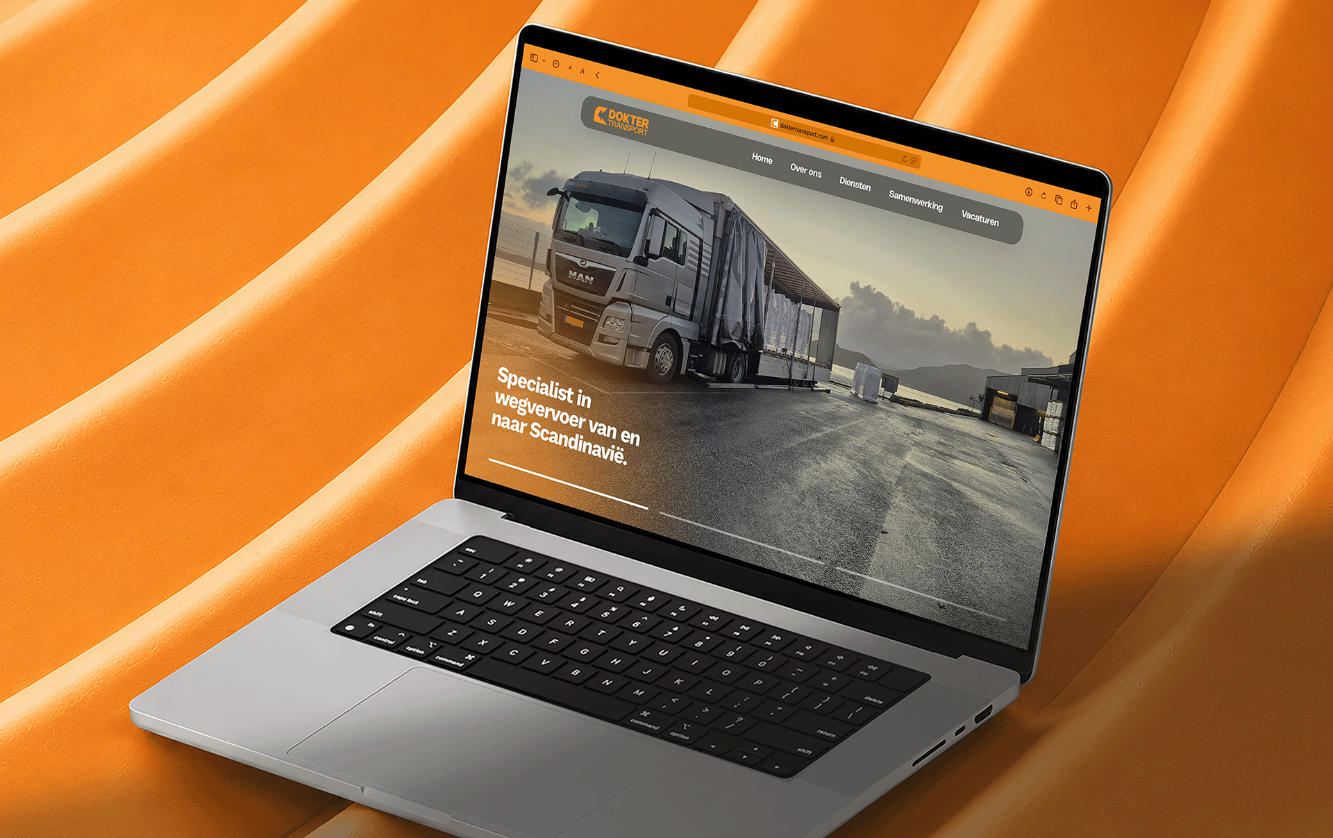
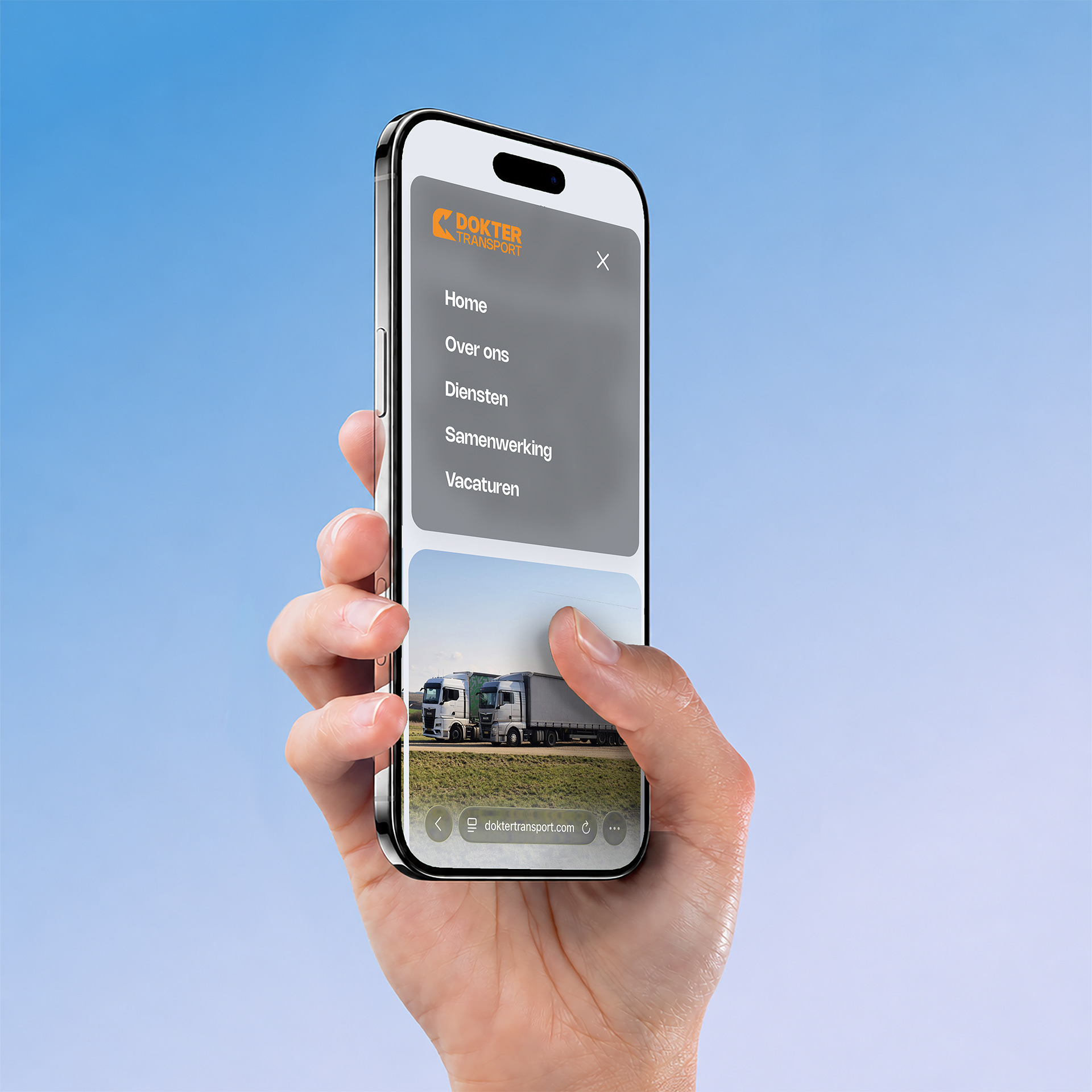
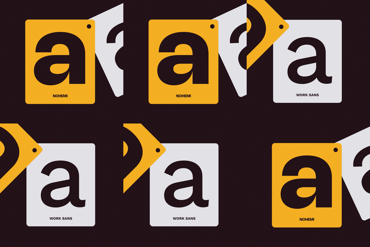
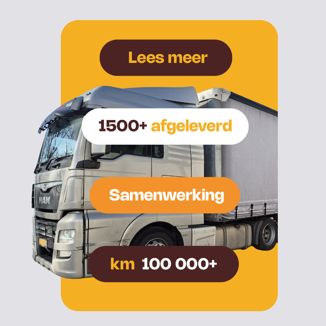
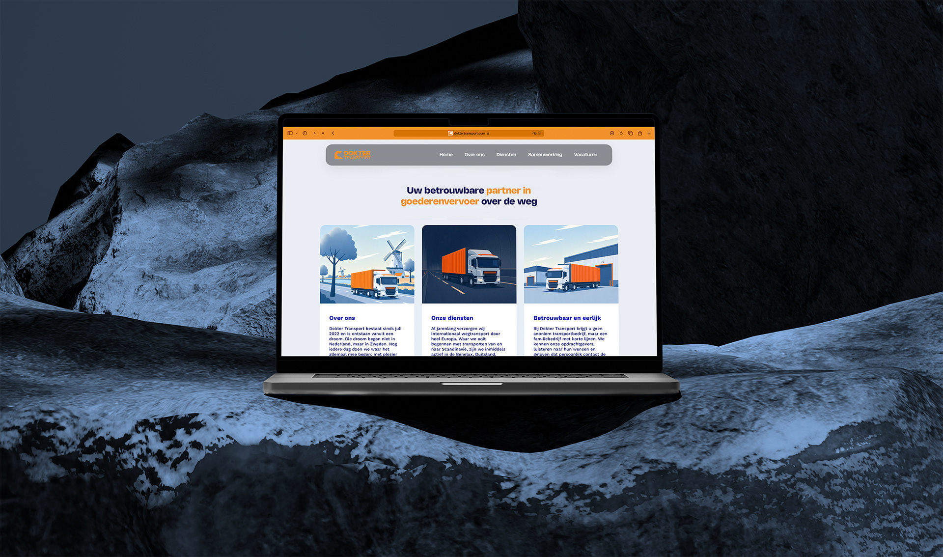
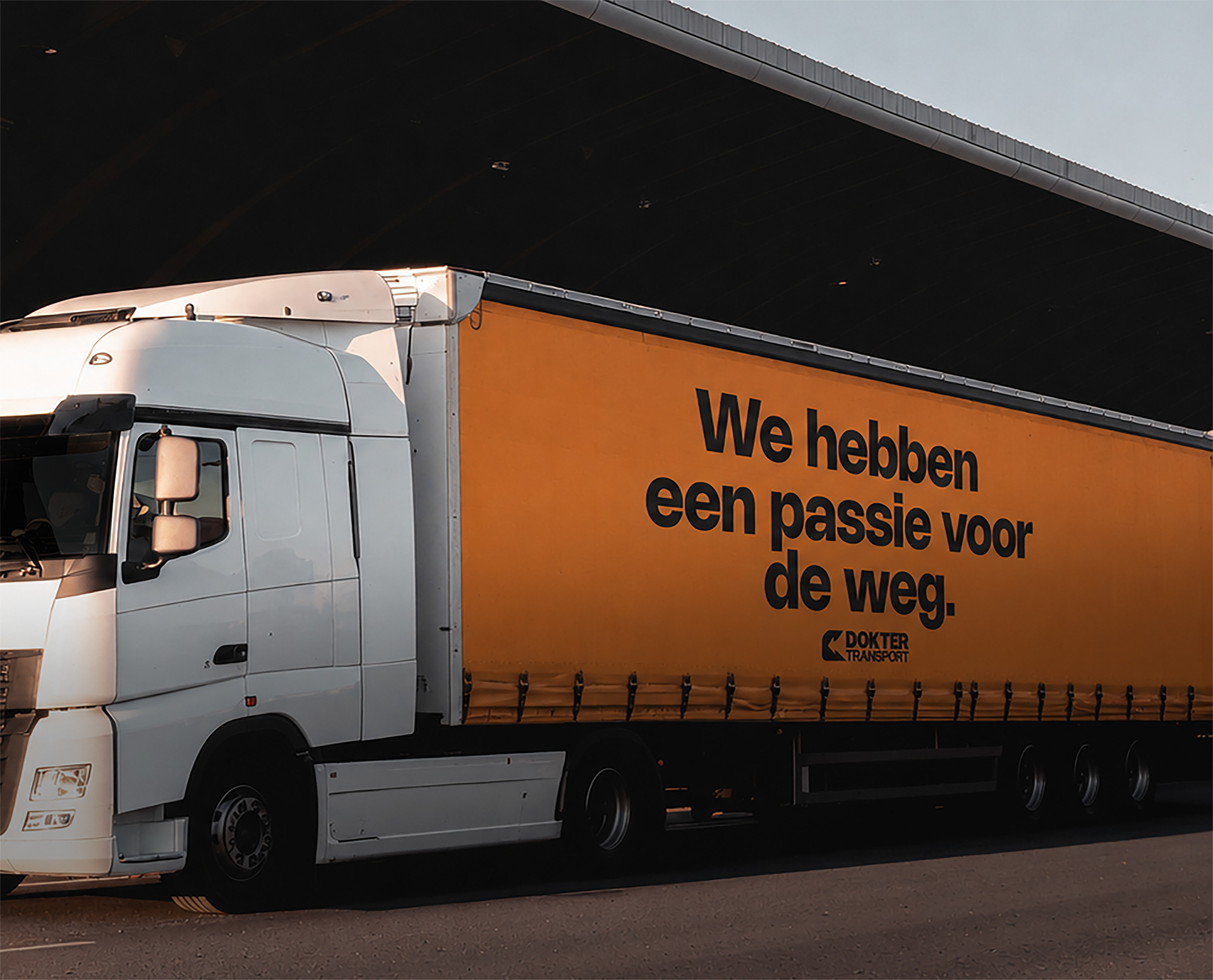
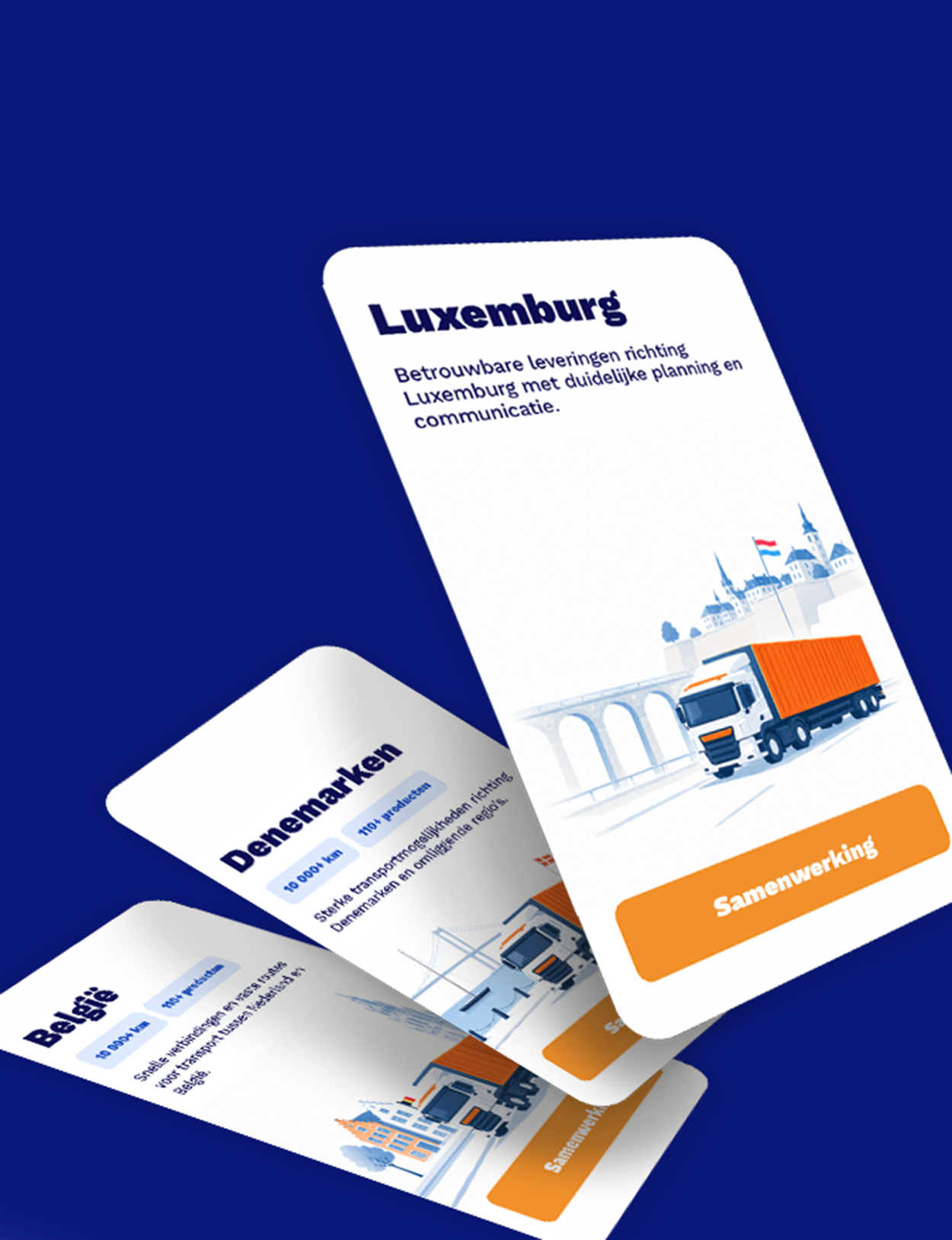
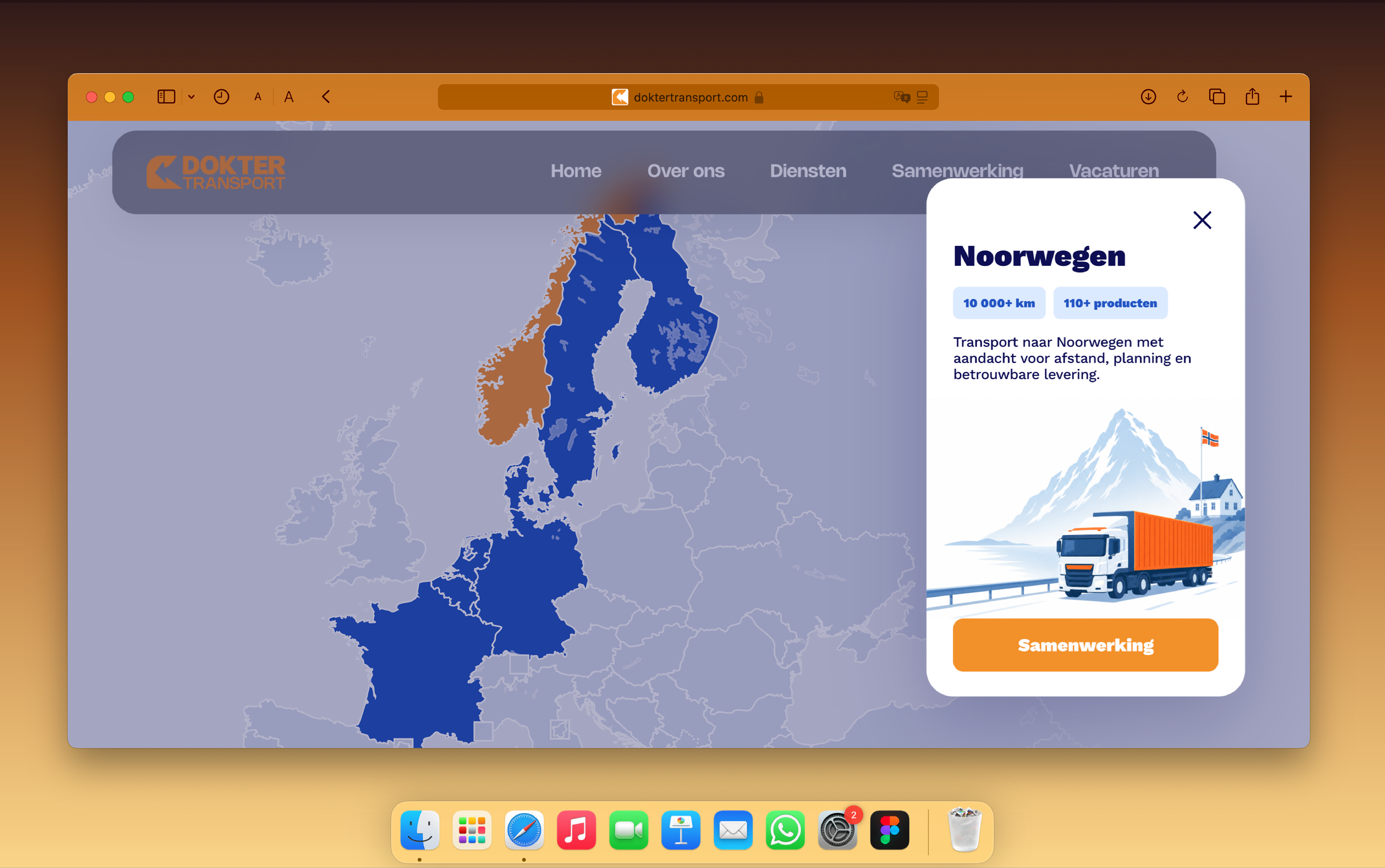
Approach: I built the identity around familiar European landmarks, roadside scenery and regional symbols, which I translated into a playful yet cohesive visual language. A colour palette that reflects on Dutch identity and natural symbols like soil, stones and skies, distinctive typography and a flexible system of illustrations brought character to the brand while ensuring it remained clear and practical across vehicles, digital platforms and printed materials. The website communicates with interactive features, inviting future partners and employees into the joy of traveling.
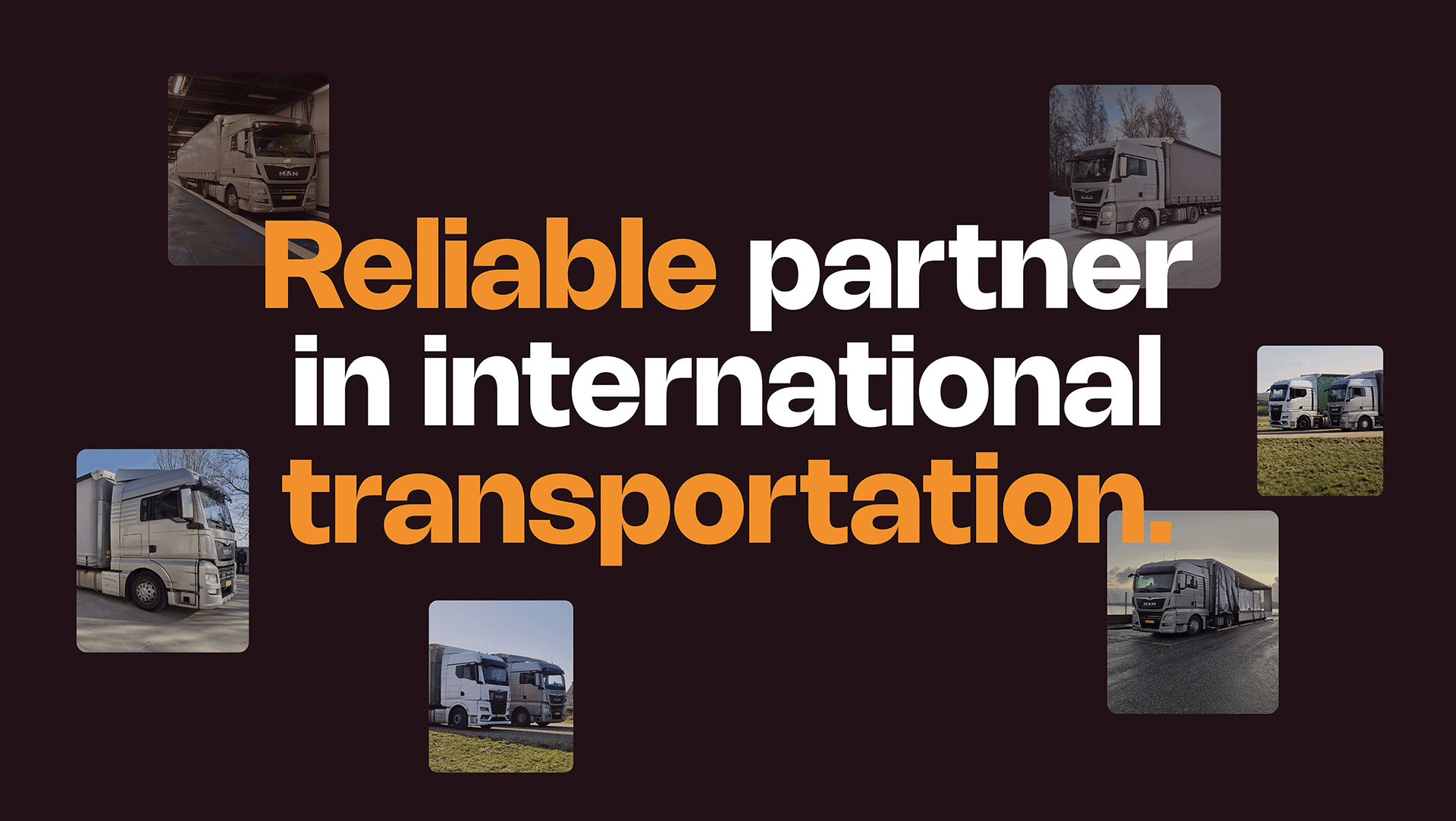
Impact: The result is a market-dominating, scalable brand identity that gives Dokter Transport a strong presence both at home and on the road. It celebrates the family heritage combining local authenticity with an outward-looking European spirit. The flexible brand system now provides a consistent foundation for the business as it continues to travel, connect and grow.